

But though pretty, the map wasn't a keeper says Design Observer:
The problem, of course, was that Vignelli's system logical system came into conflict with another, equally logical system: the 1811 Commissioners' Plan for Manhattan. In London, Henry Beck's rigorous map brought conceptual clarity to a senseless tangle of streets and neighborhoods that had no underlying order. In New York, however, the orthoginal grid introduced by the Commissioners' Plan set out its own ordered system of streets and avenues that has become second nature to New Yorkers. Londoners may be vague about the physical relationship of the Kennington station to the Vauxhall station: on the London underground map, Vauxhall is positioned to the northwest of Kennington when it's actually to the southwest, and it doesn't seem to bother anyone. On the other hand, because of the simplicity of the Manhattan street grid, every New Yorker knows that the 28th Street number 6 train stops exactly six blocks south and four blocks east of Penn Station. As a result, the geographical liberties that Vignelli took with the streets of New York were immediately noticable, and commuters without a taste for graphic poetry cried foul.
As a result, Vignelli's map, which put form above function, was replaced 7 years later with the less elegant but perhaps more accurate version that persists in revised forms today.
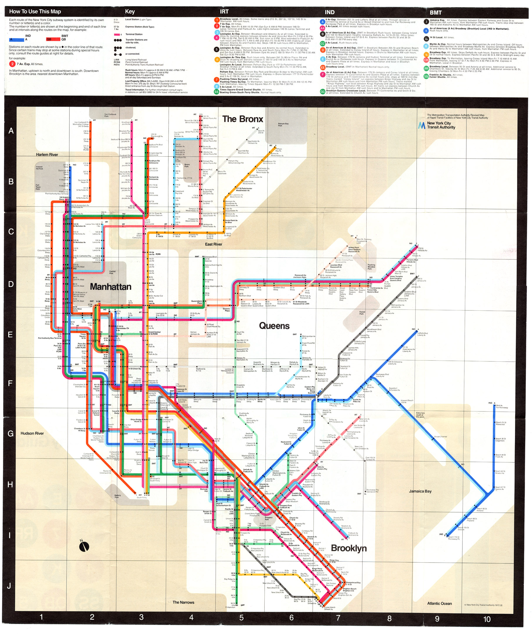
The modern map, introduced in 1979, may not be the collector's item that Vignelli's is, but it makes sense... At least to me. And to John Tauranac, one of its original designers. In a 2004 New York Times piece, Tauranac said the 1972 map was incomprehensible, based on what he said was "a certain cynical reality." The piece goes on to say:
Subway lines ran implausibly at angles of 45 and 90 degrees. To preserve its aesthetics, that map put the 50th Street stop on the Broadway line west of Eighth Avenue, far from where it belonged.
In contrast, subway lines on the 1979 map looped across the city more or less as they do in reality. Better yet, you could see where you actually were when you emerged above ground.
Some geographical distortion was inevitable, and still is. "We had to open up Lower Manhattan and squeeze the Bronx and Queens a little bit," Mr. Hertz said. But the new map was a revelation compared with the old, which often left the rider geographically clueless.
Anyone feeling nostalgic for or curious about Vignelli's design marvel can download a scanned version from nycsubway.org. Men's Vogue magazine also urged him to update the design for the 21st century, which he has graciously done.

A limited run of signed prints was available exclusively through the magazine, but sold out on May 1, 2008.